Candle shapes
The ten ways a candles panel can draw price, what each one shows, and what changes on Renko, range bars and line break.
A candles panel can draw its bars in ten shapes. They are listed in the Chart type menu below heatmap and footprint; picking one turns the selected panel into a candles panel in that shape. Footprint and heatmap panels have fixed shapes of their own.
The ten shapes
| Shape | What it draws |
|---|---|
| Candles | A body from open to close and a wick from high to low. |
| Hollow candles | Candles whose rising bars are drawn as outlines and falling bars filled. A body too thin to outline is filled, so a doji never disappears. |
| Heikin Ashi | Averaged candles that smooth out noise, so runs of one colour are easier to see. |
| Bars | A line from high to low, with a tick for the open on the left and the close on the right. |
| Line | A line through the closes. |
| Area | The same line, with the area under it filled. |
| Step line | The close held flat until the next bar, then a vertical step to the new close. |
| Renko | Bricks of equal size, one for each move of that size in the closes. |
| Range bars | Bars that each span at least a chosen price distance. |
| Line break | A new line only when a close carries past the last line, or turns back beyond the last few lines. |
In every shape, a bar is up when it closed at or above its own open and down otherwise, and takes the up or down colour. Line, area and step line use the separate line colour. All three colours are in Colours and settings.
Heikin Ashi
Heikin Ashi bars are averages, not the prices that traded. The chart keeps the real market in view: the info bar and the price line on the axis show real prices. Hover the chart type at the right of the panel's status strip to read the reminder:
Heikin Ashi — the bars are averaged; the info bar and price line show real prices
Renko, range bars and line break
These three are built from the candles underneath, and a new brick, bar or line appears only when price moves far enough. Two things follow:
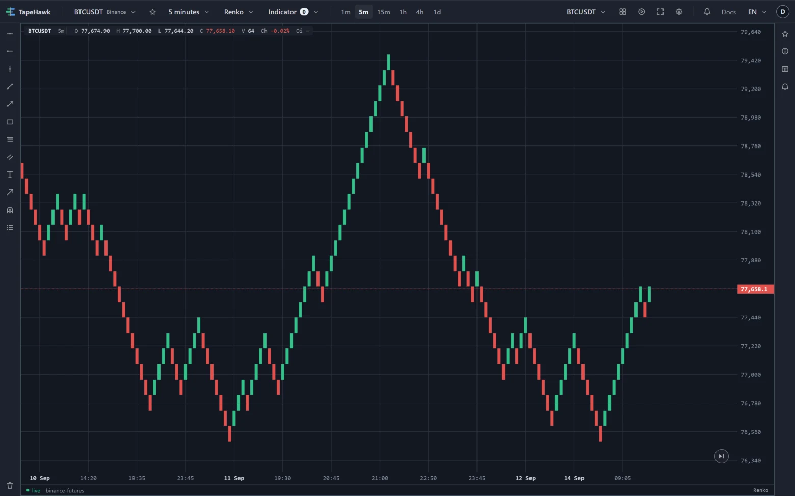
- The horizontal axis is not time. A quiet hour may add nothing, a busy minute several bricks, and the time labels skip accordingly.
- Loading older history redraws them. Scroll back and every brick, bar or line is rebuilt from the new starting point, so the ones you were looking at can shift.
As with Heikin Ashi, the info bar and the price line always show real prices, and the status strip's tooltip carries the caveat for the shape.
Settings
With one of these shapes on the selected panel, the Settings popover shows its settings under the shape's name.
| Shape | Setting | Choices |
|---|---|---|
| Renko | Brick size | ATR — size from the average true range over a period of bars (default 14); Ticks — a number of price ticks; Price — a fixed price distance |
| Range bars | Ticks per bar | A number of ticks; 0, the default, measures the size from recent volatility |
| Line break | Lines to break | 1 to 10, default 3. A close past the end of the last line extends the run in the same direction; turning the other way takes a close beyond the high or low of that many previous lines. |
Volume and indicators
- Volume is exact on range bars, an estimate on Renko (one candle's volume is shared across the bricks it makes) and partial on line break (what trades while no new line forms is not on the chart yet). The volume indicator's row in the indicator menu says which: (exact), (estimated) or (partial).
- Order-flow indicators cannot be drawn on these three shapes, and neither can indicators that draw ahead of the last bar. The indicator menu marks them (no time axis) and they come back when the panel returns to a time-based shape.